Features
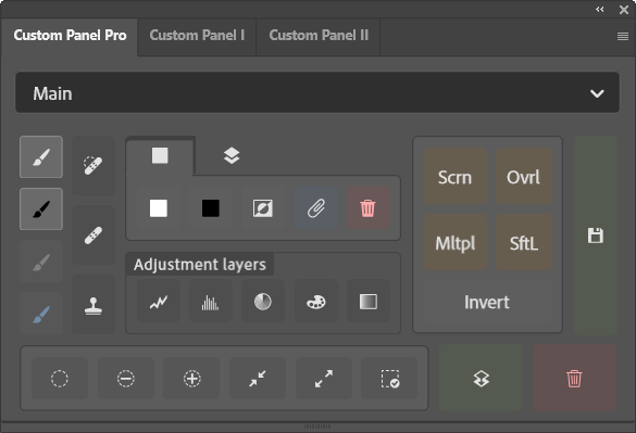
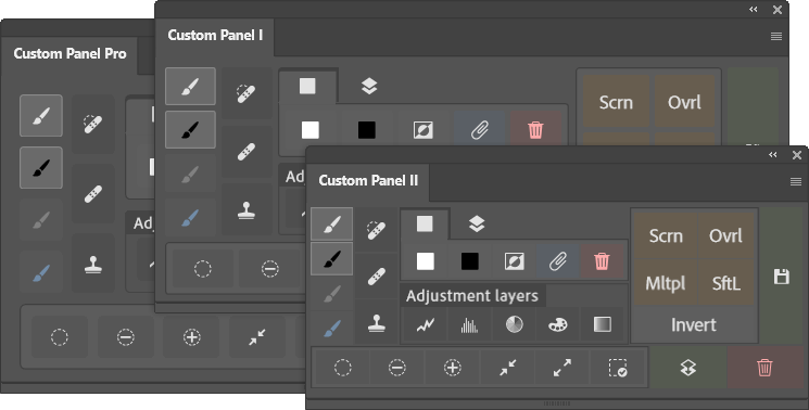
Panel is a main holder for your spaces and layouts. You can dock it almost anywhere in your Photoshop workspace or keep it floating on the screen.
Space is where you create your layout. Each panel may have multiple spaces (except on the Free version), so it's easy to separate your different workflows. Space switcher is located at the top of each panel and it can be a dropdown menu or a slider-type switcher. You have an option to hide a space switcher if there's only one space on your panel.
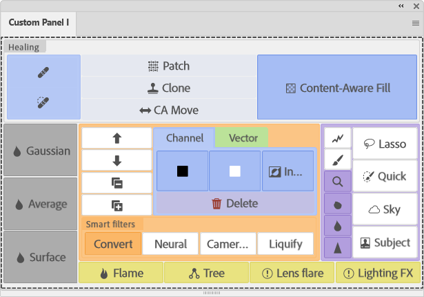
Layout is where you create the most simple or insanely complex areas for buttons and widgets.
Area is a column, a row, or a tab. By default, space behaves like a column, but you can create a row as the very first area on a space. But even if you want to have only a column of buttons, it is still best practice to create an actual column as the first area on a space. Each column, row or tab may contain another column, row, tab group, a widget or a button.
Widget may be a static or interactive element.
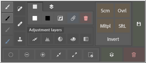
Button is the main and most configurable element of your layout, to which you assign button actions to execute when clicked.
Styles
Option to change elements size and border radius. Show or hide area labels. When label is hidden, option to disable area border. When icon is assigned to a button or a tab, there's an option to hide its label. Assign one of Photoshop colors as a backround to any area, button or tab.
Image here shows the exact same layout in three different sizes. If you have a lot of panels, you might want to reduce the size of the panel to a minimum. Element size and border radius can be set on a plugin, a panel and a space level. Element size can also be set on an area level and border radius can be set on a specific single button. Button also has an additioan large border radius.
Choose from ~900 Adobe Spectrum Workflow icons for a button or a tab, and it can be any color you want. Button can have a flat style with a semi-transparent background and no borders.
Any layout you make, will be fully responsive to panel dimensions and it will look good no matter if you decide to dock it on any side of Photoshop window, between other panels or simply leave it floating on the screen.
Button actions
There is a huge amount of button actions you can choose from. You can assign any available tool, which will be selected when you click a button. Search for almost any Photoshop main menu item and choose it as a button action. This will prevent you from navigating multi-level menus and have a button always available on a panel. If you have a collection of your custom Photoshop actions and use them constantly, make them run when button is clicked. If you want to avoid a settings dialog and create a new adjustment layer with the default options, you can assign a direct action to do that. Layer blend modes are also available. If you are switching between some brush and tool presets constantly, you can assign your most used ones. Some additional layer actions are also available - merge layers; collapse or expand all groups; create, delete or invert layer masks - even multiple at a time if several layers are selected.
Widgets
Add widgets to your custom layout. Insert them anywhere between your buttons or have just a single widget on a whole panel.
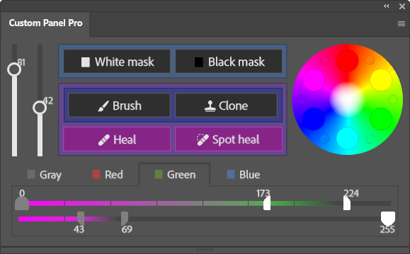
Add layer opacity slider, a fill slider or both, with options to show a value next to them. If your layout can better fit vertical sliders, ther's also such an option.
If you often use Blend-if sliders, there's a widget too. You may choose to show only one slider (current or underlying layer) or both. Option to show sliders in RGB channel tabs, where each of them contains respective sliders.
Keyboard shortcuts
Every layout button click can be recorded to your custom Photoshop action, and by default Photoshop allows you to assign a shortcut to that action. But Custom Panel goes even further and allows you to record an action, which will pop up your selected space. When you assign a shortcut to that recorded action and press it, space pop-up appears in the middle of the screen. And if you have shortcuts assigned to any buttons on that space, you can then use them. This way any button action is just two keypresses away at any time - even if all panels are closed.
Other features
Backup - all plugin settings and the layouts can be backed up and restored easily. There are also options to backup and restore only a single panel settings with all spaces and layouts or just a single space layout.
Whole plugin is theme aware - any colors you choose for the buttons or areas in your layouts, will look nice on any of the Photoshop themes. All the settings dialogs will also adapt to your chosen theme to make your experience seamless.
If you often deal with lower than 50% opacity selections or simply used to hiding marching ants, the selection indicator will always remind you if you have an active selection in your current working document. Choose if you want a dashed border to appear around the whole panel or only on top. You may have it only on a specific panel or on all three.
If screen real estate matter much, you may choose to hide a panel on button click. This option is available for the whole plugin, for a single panel, or even per button. If you set this option just on a button, only clicking this exact button will hide the panel, but not others.
Depending on how you prefer to create your layouts, you may choose to open element edit form automatically right after that element is created.
Tips and Tricks
- If you have a row label visible, you can double-click it to collapse that row
- Right-click in the main layout on a button, tab, space or any other area label, opens edit form for that element